Dear PMG 512 DAC owners,
There are a couple of things about the current display layout on the DAC that I, at least, find less than optimal.
For one, the finger-controlled volume control around the circumference of the dial is practically useless for me. I always use the remote, but if my batteries died and I had to adjust the volume from the display, there’s a far less space-consuming way to do that.
For another, the sampling information regarding the selection currently playing is so small as to be nearly invisible from my listening chair, even though I recently had a 20/20 vision check at my optometrist.
Following, I present a strawman proposal for a different layout. In the diagram, the gray dot at the bottom represents and would be replaced by the gear icon for settings. If there are those that love the current display layout and don’t wish a change, one of the settings available might be to choose the original if you’d like. After all, it’s just software—a second display function or template depending on how the code currently works.
Anyway, I realize I don’t have to tell my fellow forum folk to supply comments, positive, negative, or otherwise . I expect you’ll do that, regardless.
— Chris
5 Likes
I 100% agree that much of the display is unreadable from chair.
The circle vol is nice (and cool), but could be hidden until you touch the screen where it would “reformat” itself to be smaller and put in the circle. After time (say 5 seconds) it would revert back to the larger letters.
But the up down would work too, but they would be pretty small. But there is zero need for both the circle and number to be on at the same time. For those that use it as pre the numbers are better. So I like the reformat idea better than the small up down.
I believe that ship has sailed.
maybe, maybe not. obviously they have many other priorities, but once the dust settles, this could be done.
I agree about small display design in general.
It’s an interesting design era right now with quite a few manufacturers displaying small text and numbers on already small displays - almost as if the intention is desk usage.
Why not have another display layout as optional?
Other brands offer different display options. Besides layouts, one could play with color schemes too!
This is calling for further user engagement, if permitted and first priorities are satisfied.
I generally agree with screen recommendations, but in light of the significantly better functionality, legibility, and feel from those of the previous PSA displays, I consider this quite an achievement.
I do marvel, however, at what can be done, say, on an inexpensive Eversolo piece, that is icon based, intuitive, and has user customization. It’s easier when I don’t have to think what thing does what.
4 Likes
Even overwriting without reformatting would probably be fine since the volume would still be completely visible, as it is now, while you were changing its value. Touch the volume value, circumference circle is displayed, adjust the value, remove the circle a few seconds after you lift your finger, as you suggest.
— Chris
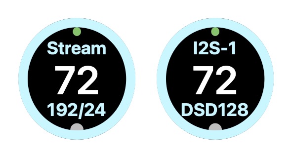
Here’s what the display would look like with your suggestion, with only a partial circle, of course:
1 Like
Seems like a simple firmware upgrade. Once in the menu, everything else could remain the same theoretically since you would need to be with the unit up close.
I would add a slash between the Sample and Bit rates (192/24). When set to Fixed volume, I would remove the volume number.
BTW: Is this an OLED display? It looks very dark when turned off. If it is OLED, then eventually you will get screen burn in from the constant display of the volume numbers.
1 Like
They came from the Android ecosystem (making google TV type set top boxes under the name zidoo). They have done a huge amount work to customize android and have a large development team around that and were also able to bypass remove some of the android “plumbing” that hurts sound quality, like the ability to bypass the software mixer/resampler and other stuff.
I personally have a phone/tablet that I browse and stream music with and hide away my gear but I understand those that like a big display running a tablet type UI too.
3 Likes
Love this idea - with the DAC serving as a fixed line in volume to the preamp - the 100 becomes something simply consuming real estate. Would be wonderful if when selecting fixed volume one could maybe have the volume value and the format value switch place. I would find it far more valuable to have the format values and whether PCM or DSD as the largest display element
One other things while on the subject of appearance - perhaps a niche request - but when the Dim button on the remote is pushed and the screen is darkened it would be ideal if there was an option to dim the logo / sleep button as well?
In my case the system is in my bedroom and on the top shelf of my equipment rack - so being able to darken the blue square without resorting to daily application of electrician’s tape would be awesome. On my K50 there is the option of a quick push of the power button which switches the light off
2 Likes
Okay, here’s my latest idea, displaying the selected filter. The displays show, from left to right,
- default filter selected
- filter 2 selected
- filter 3 selected, and volume level tapped to display volume ring
I haven’t thought about bladeraptor’s suggestion to change the display when fixed volume is selected.
— Chris